Customize the appearance
Get Cord looking and feeling like your application
Adjust the CSS #
Cord's SDK components are customizable with CSS and some CSS variables for theming. Let's say that your application needs the profile pictures in the presence facepile to be a bit larger and fully round, for example. You can achieve this with the following CSS:
cord-page-presence .cord-avatar-container {
  width: 36px;
  height: 36px;
  border-radius: 50%;
}
This change will give you a facepile that looks something like this:
You might want to add styling to the component itself. If, for example, you wanted to put a border around the entire page presence facepile, you might add CSS like this:
cord-page-presence {
  border: 1px #ccc solid;
  border-radius: 12px;
  padding: 12px;
}
You should now see a bit more spacing and a simple gray border around the entire facepile:
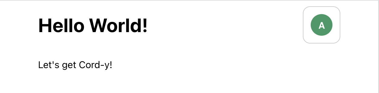
Take the customization even further #
You can customize many more aspects of Cord's components by writing some CSS to target classes starting with cord-. For the full description of what's available for the <PagePresence /> component, check out the full list of class names.
If you'd like to dive deeply into the topic of CSS customization, read our CSS guide.
▶ Can I just use vanilla CSS?
Yes! You can write any CSS, using all the tools you're familiar with. Feel free to target any class name starting with cord- and make Cord look exactly like you want.
Next Step: Add a conversation thread #
In the next step, you'll add a second Cord component -- the conversation thread →
Not finding the answer you need? Ask our Developer Community