Threaded Comments
Display all the Threads in a given location, add new Threads, and reply inline with a flexible, embeddable UI component. Threaded Comments is ideal for showing conversations on a page, or creating a comment section.
When to use #
The <ThreadedComments /> component renders a composer and a list of comments. Every new comment created from that composer will appear in the same list. You can react and reply to each comment inline.
This component is great for an all-in-one threaded commenting experience. If you don't want multiple threads, take a look at the single Thread component instead.
How to use #
import { ThreadedComments } from "@cord-sdk/react";

export function Example() {
  return (
    <ThreadedComments
      location={{ page: 'index' }}
      groupId="my-group"
      composerPosition={'top'}
      topLevelComposerExpanded={false}
      onMessageClick={({ threadId, messageId }) =>
        console.log("user clicked on:", threadId, messageId)
      }
    />
  );
}Source code #
Threaded Comments is built on top of our lower-level components and APIs, such as the Message component and our Thread API. The complete source code is available here under a permissive license. You can use it to learn from as an example, or even copy-paste into your own app to remix and build a custom experience.
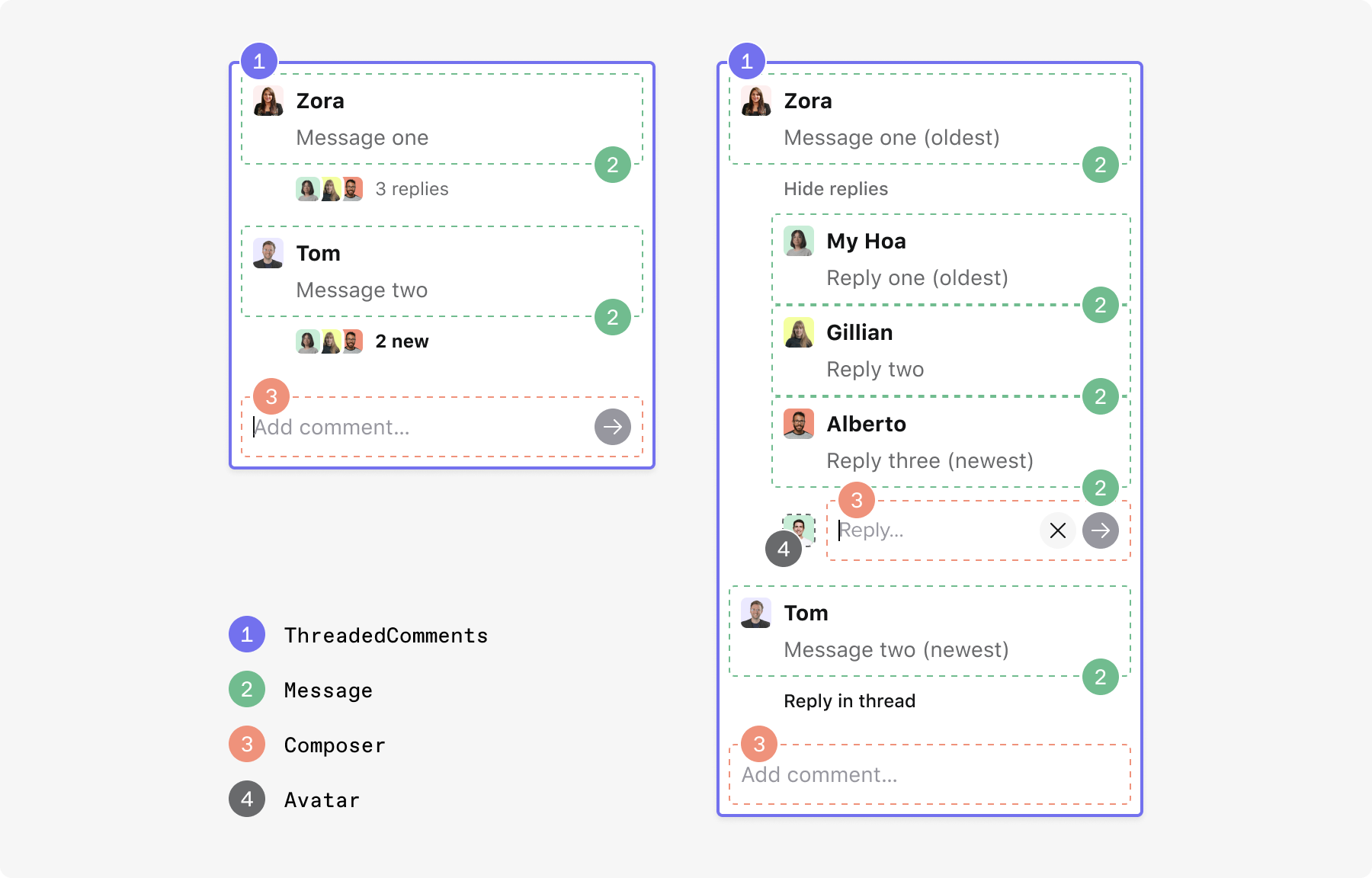
Anatomy #
This diagram shows how Threaded Comments is built using other, smaller, Cord components. Use this to help style your integration, or to break apart and create something new.
Properties #
Threads with this location will be shown by the component. Any new threads will also be created with this location.
false, only threads that exactly match the provided location are shown. If true, threads in any partially matching location are also shown.false.composerPosition is set to none, in which case it may be omitted. Doing so will cause the component to fetch threads from all groups the user is a member of.ThreadedComments.This property controls the criteria for how threads are sorted. Combined with `scrollDirection`, it determines which threads are "first".
It's a string enum which can have one of the following values:
If set to first_message_timestamp, threads will be sorted by the timestamp of the first message in the thread. In other words, threads will be sorted based on how recently they were created.
If set to most_recent_message_timestamp, threads will be sorted by the timestamp of the most recent message in the thread. In other words, threads will be sorted based on how recently they were responded to.
The default value is first_message_timestamp
This prop controls the order in which threads are displayed. It takes one of two possible values: up or down.
If set to up, the newest thread will render at the bottom, which means that you will need to scroll up to see older threads.
If set to down, the newest thread will render at the top, which means that you will need to scroll down to see older threads.
Note: Which threads are "newer" is determined by the sortBy property, documented above.
The default value is descending.
Takes one of two possible values: top or bottom.
If set to top, the composer will be rendered above the list of threads.
If set to bottom, the composer will be rendered below the list of threads.
If set to none, the composer will not appear at all.
The default value is bottom.
If true, the top level composer will always appear expanded. This means that it will always show the button list (such as the mention button and emoji button) right below the editor.
If false, the top level composer will start from a single-line state, but will expand when a user clicks in the editor or starts typing. It will return to a single-line state when it loses focus and there is no input in the editor.
The default value is false.
composerExpanded property above,
but to the composers for replying to a thread.Takes one of the following values: initiallyCollapsed, initiallyExpanded oralwaysCollapsed.
If set to initiallyCollapsed, thread replies will initially show a facepile and the number of replies, if any. On click, the replies will become visible, together with a composer.
If set to initiallyExpanded, all replies will initially be visible. Both hiding them and replying will be available.
If set to alwaysCollapsed, a facepile and the number of replies for a thread will be shown, if there are any, but viewing the replies and replying will be disabled.
The default value is initiallyCollapsed.
.cord-threaded-comments.cord-highlighted.true, the top-level composer input
field will render with the autofocus HTML attribute set.false.true, a tooltip with the user's displayName will
appear on the Facepile with the profile pictures of the users who have replied to each thread. The default value is falsethreadUrl defaults to window.location.href. Setting this
property would override that default.false, when the the location specified in the component has no threads,
ThreadedComments will show a completely empty div. If set to true, ThreadedComments will instead show a
placeholder, containing a facepile with the people who will be able to view the threads and a prompt to add a
comment.true.This property tells ThreadedComments how to display resolved threads. It takes one of the following values: unresolvedOnly, resolvedOnly, tabbed, interleaved or sequentially.
If set to unresolvedOnly, only unresolved threads will be shown.
If set to resolvedOnly, only resolved threads will be shown.
If set to tabbed, two tabs will appear on the top part of the component, with "Open" and "Resolved" labels respectively. Clicking on each of them will filter for the relevant threads. Note that when resolved threads are visible, the composer will not be shown since it doesn't make sense to create a new, but already resolved thread.
If set to interleaved, whether a thread is resolved or unresolved is ignored with this setting. All threads appear together and are sorted together (by the order specified by the scrollDirection property) regardless of whether or not they are resolved.
If set to sequentially, both resolved and unresolved threads will appear together. However, unresolved threads will appear first, followed by a button that when clicked, will expand a section of resolved threads. The order of the three elements (unresolved threads, "show resolved" button and resolved threads) is controlled by thescrollDirection property. For example, if scrollDirection is set to down, the elements will appear in the aforementioned order. Otherwise their order will be reversed.
The default value is unresolvedOnly.
{ threadId: string; messageId: string; thread: ThreadSummary; message: ClientMessageData;} containing
information about the clicked message.onRender to determine when loading is complete.onLoading to determine when a component begins loading. The callback is passed an object of type `{threadId: string; thread: ThreadSummary | null}` containing information on the thread linked to the composer.{threadId: string; thread: ThreadSummary | null} containing information on the thread linked to the composer.{threadId: string; thread: ThreadSummary | null} containing information on the thread linked to the composer.{threadId: string; messageId: string; thread: ThreadSummary} containing details linked to the message sent.{ threadId: string; messageId: string; thread: ThreadSummary; message: ClientMessageData;} containing
information about the hovered message.{ threadId: string; messageId: string; thread: ThreadSummary; message: ClientMessageData;} containing
information about the hovered message.onMessageMouseEnter.{ threadId: string; messageId: string; thread: ThreadSummary; message: ClientMessageData; }. Use `onMessageEditEnd` to determine when editing is complete.{ threadId: string; messageId: string; thread: ThreadSummary; message: ClientMessageData; }. Use `onMessageEditStart` to determine when editing begins.{threadID: string; thread: ThreadSummary} containing the thread's ID and summary.threadId identifying the thread which was resolved.{threadID: string; thread: ThreadSummary} containing the thread's ID and summary. The callback is passed an object containing the `threadId` identifying the thread which was reopened.CSS customization #
If you want to customize this component, you can target the classes below in your app's CSS. These are guaranteed to be stable.
This component itself makes use of the following components. Take a look at their documentation for what classes are available to target within those components.
The following classes are also available specific to this component:
.cord-threaded-comments-tab-container- Applied to the tabs that appear on the top of the component.
.cord-threaded-comments-tab- Applied to the individual "Open" and "Resolved" buttons within the aforementioned
tabContainer. .cord-threaded-comments-thread-list- Applied to the high-level list of threads. Although it is a list of threads, it is not actually a
ThreadListcomponent, hence the long name. .cord-threaded-comments-expand-resolved-button- Applied to the "Show resolved threads" button, which appears when the display resolved property is set to
sequentially. .cord-empty-state-placeholder- Applied to the container of the placeholder that appears when there are no messages.
.cord-empty-state-placeholder-title- Applied to the title of the placeholder when there are no messages.
.cord-empty-state-placeholder-body- Applied to the body of the placeholder when there are no messages.
.cord-threaded-comments-thread- Applied to an individual thread. Although it represents a thread, it is not actually a
Threadcomponent, hence the long name. .cord-threaded-comments-resolved-thread-header- Applied to the header which appears above the avatar and name of resolved threads.
.cord-threaded-comments-reopen-button- Applied to the "Reopen" button, which appears when hovering on the header of a resolved thread.
.cord-expand-replies- Applied to the button below the first message of each thread, to expand the replies to that thread.
.cord-replies-container- Applied to the container holding the
Messagecomponents which are the replies to a thread. This may appear below the initial message of a thread. .cord-hide-replies- Applied to the "hide replies" button.
.cord-show-more- Applied to the button to load more threads, as well as the button to load more messages in a thread.
.cord-viewer-avatar-with-composer- Applied to the container containing the combined viewer avatar and composer, which can appear inside each thread as the "reply" composer.
Next up #
Not finding the answer you need? Ask our Developer Community